

In this blog I wish to discuss some personal approaches used for interpreting pit optimization data. I’m not going to detail the basics of pit optimization, assuming the reader is already familiar with it .
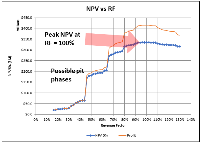 Often in 43-101 technical reports, when it comes to pit optimization, one is presented with the basic “NPV vs Revenue Factor (RF)” curve. That’s it.
Revenue Factor represents the percent of the base case metal price(s) used to optimize for the pit. For example, if the base case gold price is $1600/oz (100% RF), then the 80% RF is $1280/oz.
The pit shell used for pit design is often selected based on the NPV vs RF curve, with a brief explanation of why the specific shell was selected. Typically it’s the 100% RF shell or something near the top of the NPV curve.
However the pit optimization algorithm generates more data than just shown in the NPV graph. An example of that data is shown in the table below. For each Revenue Factor increment, the data for ore and waste tonnes is typically provided, along with strip ratio, NPV, Profit, Mining cost, Processing, and Total Cost at a minimum.
Luckily it is quick and easy to examine more of the data than just the NPV curve.

In many 43-101 reports, limited optimization analysis is presented. Perhaps the engineers did drill down deeper into the data and only included the NPV graph in the report for simplicity purposes. I have sometimes done this to avoid creating five pages of text on pit optimization alone, which few may have interest in. However, in due diligence data rooms I have also seen many optimization summary files with very limited interpretation of the optimization data.
 Pit optimization is a approximation process, as I outlined in a prior post titled “Pit Optimization–How I View It”. It is just a guide for pit design. One must not view it as a final and definitive answer to what is the best pit over the life of mine since optimization looks far into the future based on current information, .
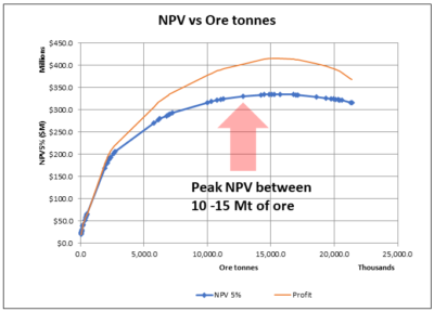
The pit optimization analysis does yield a fair bit of information about the ore body configuration, the vertical grade distribution, and addresses how all of that impacts on the pit size. Therefore I normally examine a few other plots that help shed light on the economics of the orebody. Each orebody is different and can behave differently in optimization. While pit averages are useful, it is crucial to examine the incremental economic impacts between the Revenue Factor shells.
What Else Can We Look At?
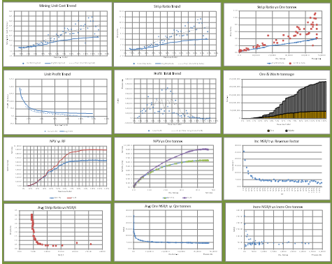
The following charts illustrate the types of information that can be examined with the optimization data. Some of these relate to ore and waste tonnage. Some relate to mining costs. Incremental strip ratios, especially in high grade deposits, can be such that open pit mining costs (per tonne of ore) approach or exceed the costs of underground mining. Other charts relate to incremental NPV or Profit per tonne per Revenue Factor. (Apologies if the chart layout below appears odd…responsive web pages can behave oddly on different devices).


Conclusion
 It’s always a good idea to drill down deeper into the optimization output data, even if you don’t intend to present that analysis in a final report. It will help develop an understanding of the nature of the orebody.
Nice charts! One that I used to employ is to increase the Whittle cutoff grade to find the optimal NPV. It’s been a while, so I can’t recall if I did it on a selected pit shell, but I think that’s how I did it. As the cutoff grade increases the NPV will also increase….to a maximum, and then it will begin to decrease.
Thanks for the feedback. I haven’t done that before, other than manually taking a shell and doing a grade-tonnage curve within it. Perhaps running multiple optimizations at different base case prices may achieve that in a way. Lower prices would yield higher COG’s, but also yield lower NPV’s since the base price is used in the revenue calc.
Once you’ve selected a pit shell, simply do a few runs with different cutoff grades. Each run will provide an NPV. If you chart NPV against grade you will get a parabolic curve. The peak of the curve will be the correct cutoff. Anything economic below that grade can be stockpiled and possibly processed at a later date.
If you pick a different pitshell you will get a similar curve. Charting a few pitshell curves will give you a 3D “dome” shape, and you can see where the best NPV is located.